Thirst Club came to us looking to revamp their current branding to showcase more of their personality. They wanted branding that reflected their humor and knowledge in the industry with a classy edge. They needed a visual identity with authentic charm and a bold new look.
The Process
We worked closely with our client to understand their goals as a growing business, their ideal audience, and the personality they wanted to showcase. To create a cohesive and genuine brand, we kept this information in mind during the process.
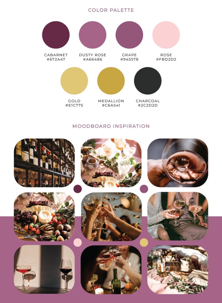
The Color Palette
The color palette features a rich cabernet base, complemented by lighter grape and floral tones that evoke elegance rooted in wine-inspired hues with subtle touches of femininity. Two gold accents further enhance the sense of refinement and sophistication. Together, the palette creates an intimate atmosphere of celebration, warmth, and class.
The Meaning Behind the Brand
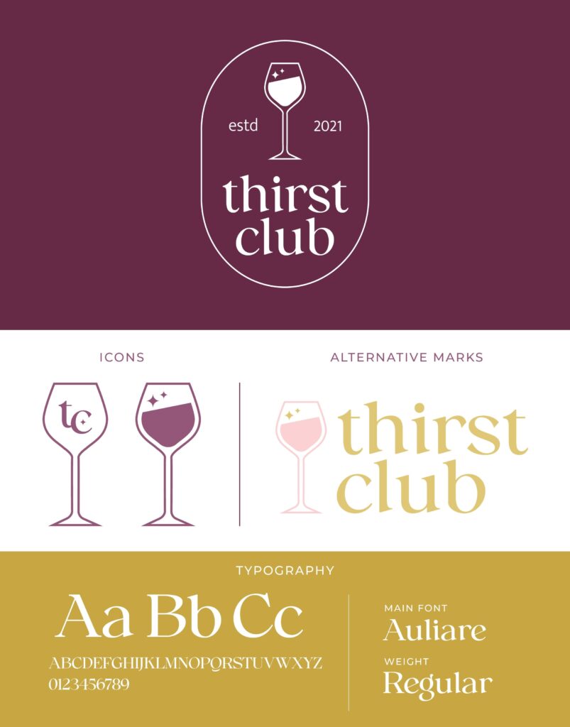
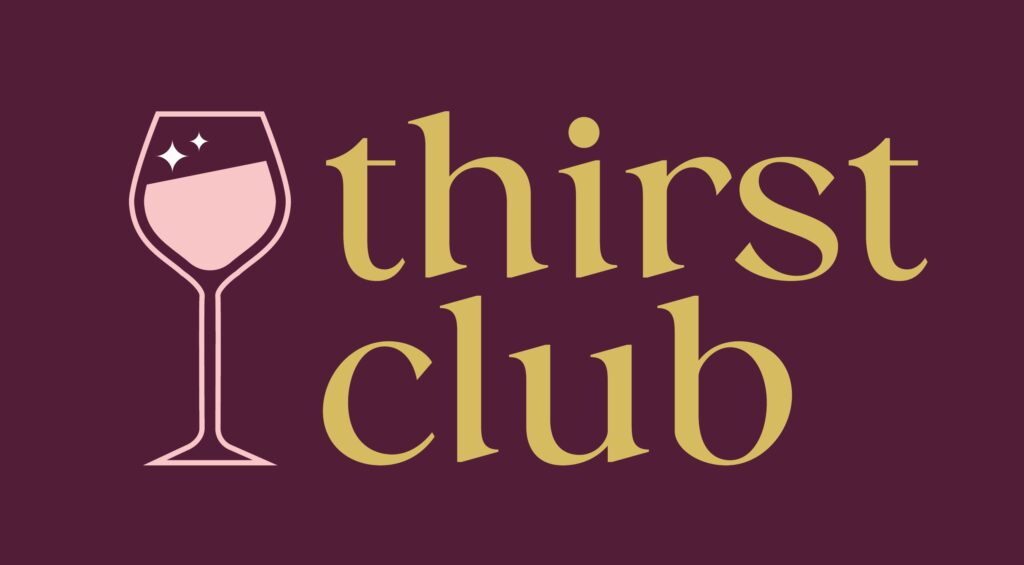
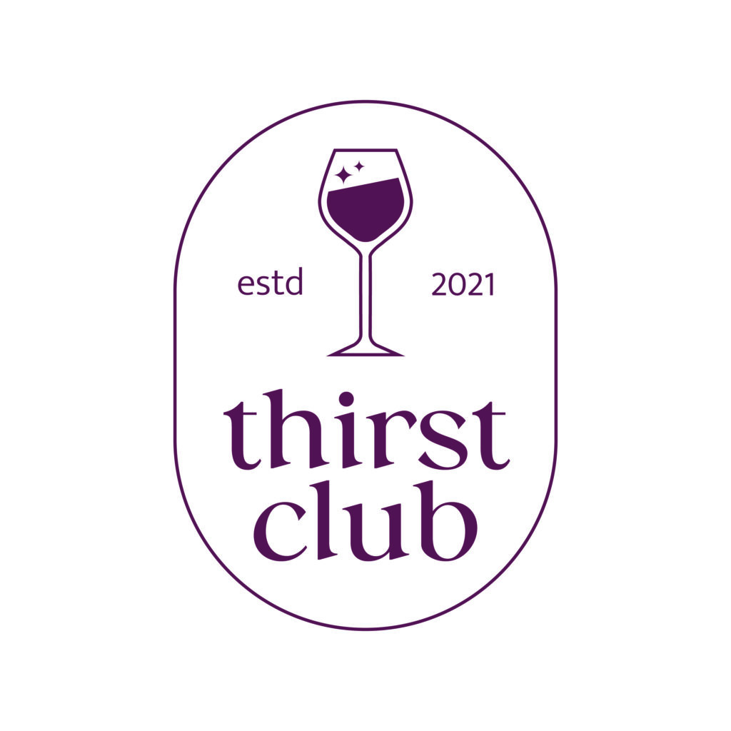
Thirst Club is a pop-up wine event/club founded by two genuine and knowledgeable wine enthusiasts. To showcase their unique business, we created a bold and modern identity with a classy yet playful essence. The typography was chosen to reflect a timeless edge, paired with simplistic wine glass icons with a touch of sparkle.
The Solution
Through thoughtful collaboration, we were able to create a visual identity that reflected the owners’ lively personalities. They now have cohesive branding that showcases their authenticity and unique business model.