The founder of SkyRoot Craniosacral came to us with a problem. Her previous business name was no longer working for her. It wasn’t resonating with the direction she wanted to grow in and it wasn’t attracting the ideal clientele she wanted to serve. We were grateful she chose us to collaborate with her to build her new brand identity.
The Process
We worked closely with our client to define her ideal audience, clarify her business goals, and uncover the deeper purpose behind her passion for craniosacral work. This foundation guided every creative decision.
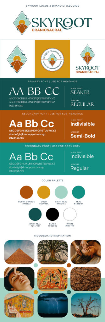
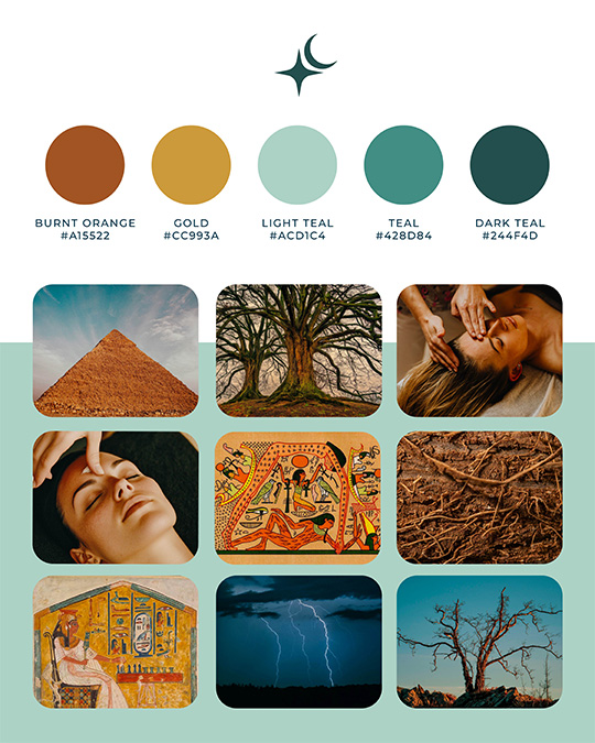
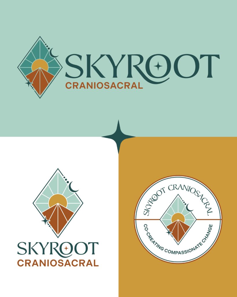
The Color Palette
The color palette was intentionally designed to reflect the harmony between earth and sky. Deep blues and teals evoke openness, flow, and healing energy, while warm golds and rust tones bring in a sense of grounding, vitality, and transformation. Together, they create a visual language that feels both stable and alive, mirroring the balance of stillness and movement within Craniosacral Therapy. The result is a palette that feels organic, spiritual, and expansive.
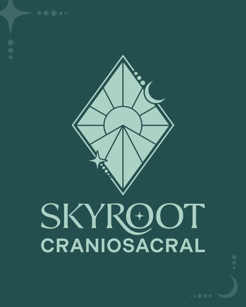
The Meaning Behind the Brand
The logo builds on this balance, inspired by the Egyptian story of Geb and Nut. A radiant sun sits at the center, symbolizing energy, clarity, and renewal. Below it, a pyramid form represents the earth or a mountain, grounding the mark in stability and growth. Surrounding these elements, a continuous line weaves together the moon, planets, and stars, creating a sense of connection and flow between the earthly and the cosmic. The composition reflects alignment, unity, and a deep sense of balance.
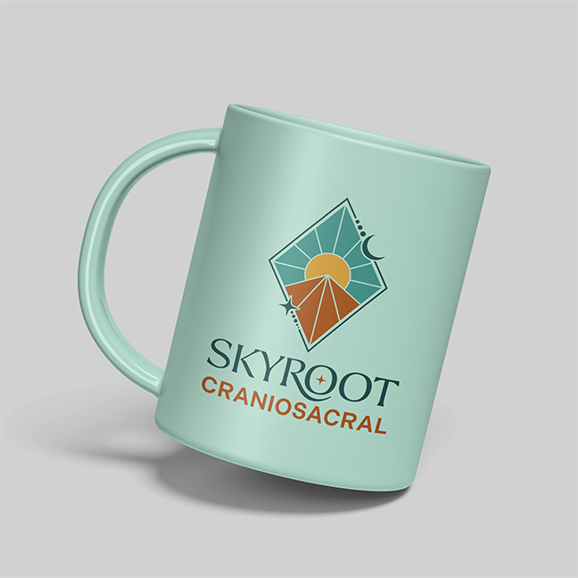
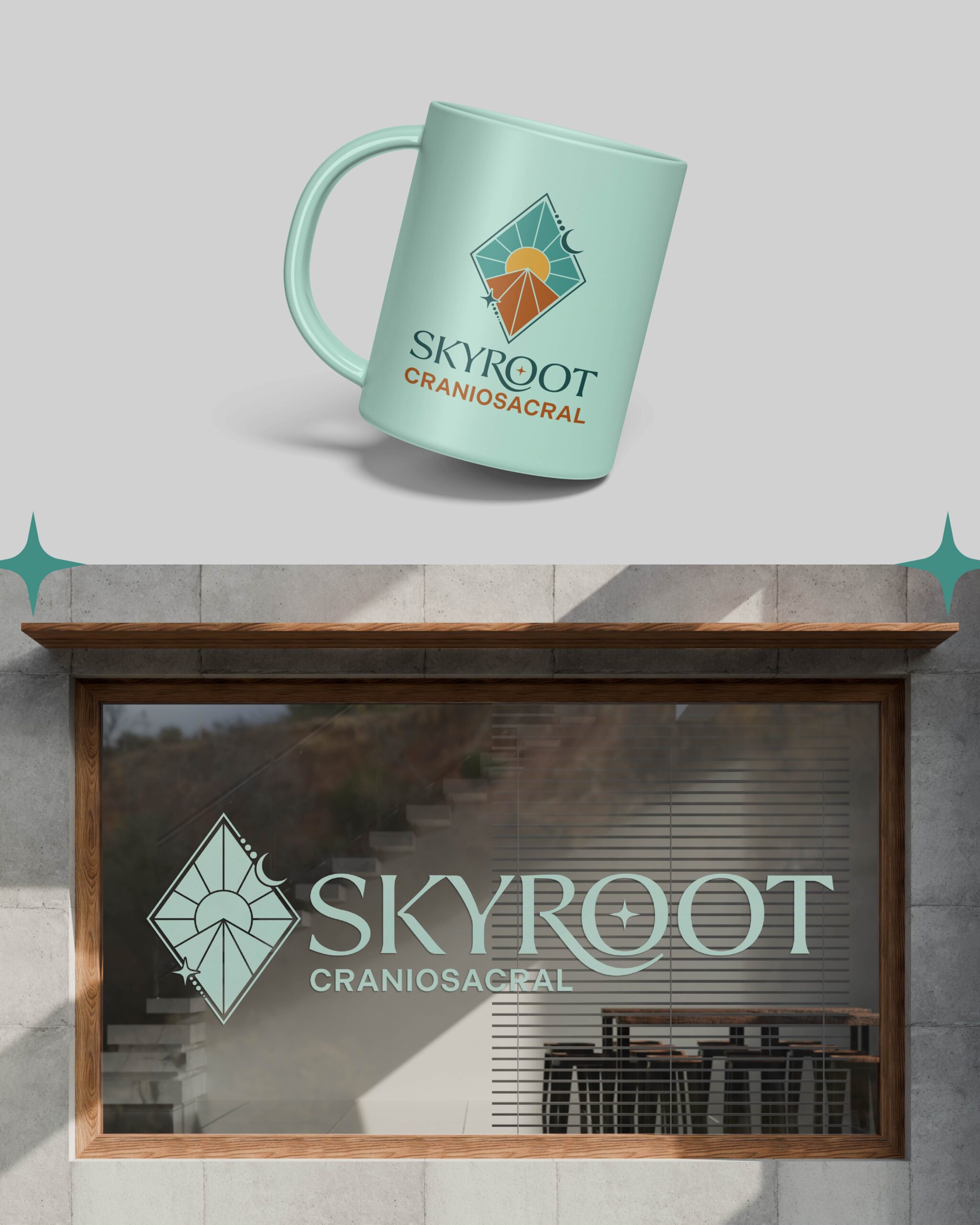
Every element of the brand was designed to make a meaningful healing practice feel clear, approachable, and professional without losing its depth. From the logo system to the visual direction, the brand feels calm, grounded, and trustworthy for real people and real families. Our client’s trust throughout the process allowed us to create something we are all truly proud of.
The Solution
Through collaboration and exploration, we uncovered a direction that felt fully aligned with her vision. The final brand identity is both relatable and refined, supporting a powerful service with clarity and intention. Rooted in purpose and designed for growth, the Skyroot Craniosacral brand now reflects the depth of her work while inviting others in. We look forward to developing Phase 2 and helping her build her printed materials, online presence and social media strategy! Stay tuned!