Seraphim came to us looking for a comprehensive website to showcase the many services she provides. She wanted a site that was easy to navigate and showcased the soft care behind her brand. In addition to the site, her color palette was in need of a refresh as well. Her previous palette was dark and grey, which did not resonate with her warm approach to self-care.
The Process
We worked closely with our client to understand her target audience and decide how she wanted to showcase her vast wisdom and provided services. We kept these insights in mind while tweaking her palette and creating her website.
The Color Palette
Her previous color palette consisted only of a dark blue, dark grey, and stark white. She needed an updated palette that felt inviting, soft, and warm. With these goals in mind, we developed a new palette that still includes a dark shade for contrast, but shifts toward a richer purple tone for a more feminine touch. We also introduced a light purple, a soft blue, and a warm vanilla to bring brightness and a sense of compassion to the site. Together, these colors create a more personal, feminine, and approachable visual identity.
The Website
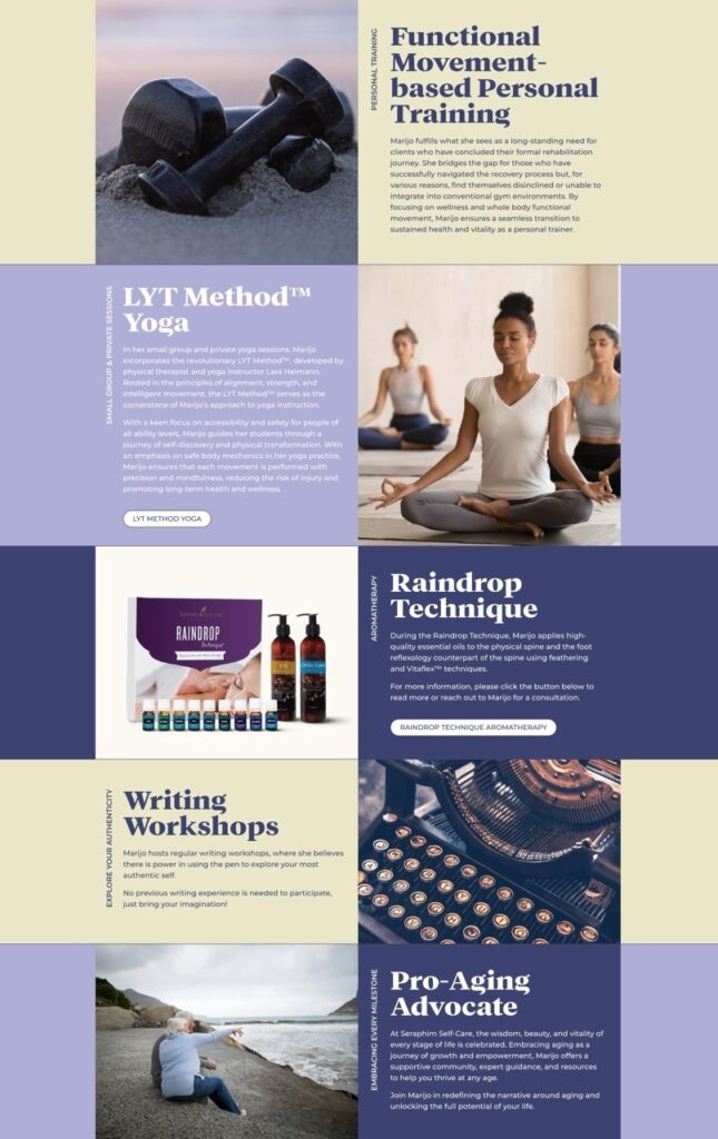
This one-page site was designed to be simple yet elegant, showcasing all of Seraphim’s offerings. It includes a section that introduces the face behind Seraphim, along with her credentials, followed by an easy-to-navigate overview of her services and physical products. The goal was to present all essential information clearly without overwhelming the user, creating an organized and inviting online presence.
With mindful collaboration, we were able to not only create a comprehensive website but also update her color palette to reflect her warmth and genuine approach to self-care. The palette and website now reflect the soft and spiritual care that she provides. We also created a soft floral pattern to accompany her site to create depth and give her more of a visual identity beyond a logo.