Rift Media reached out to us, looking to refresh their current branding, which they didn’t feel truly represented their business. Their previous branding felt outdated and impersonal, which was not reflective of their personalities. They needed a new visual identity that showcased their bold and youthful energy, while remaining professional and clean.
The Process
We worked closely with our client to clearly define their ideal audience, understand their goals as a growing company, and determine how to help them stand out from the crowd. We kept these insights in mind while building their unique new brand.
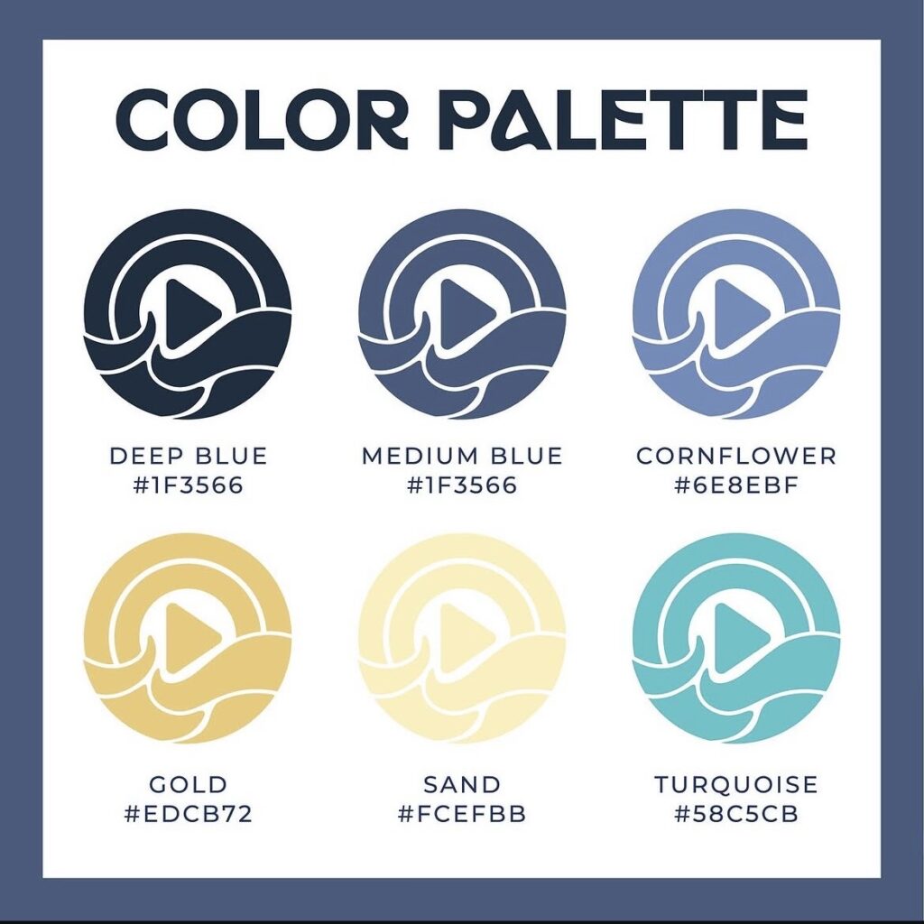
The Color Palette
This palette was designed to reflect the beachy essence of one of the co-owner’s hometowns of Humble County, California. The deep blue creates a grounded professionalism, while the lighter blues evoke the feeling of calm ocean waves. The sand and gold colors bring a warm and youthful feeling that is reflective of the beach, while bright turquoise adds a pop of vibrant energy. Together, these colors reflect a bold and inviting feeling that appeals to their ideal audience.
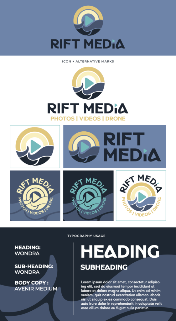
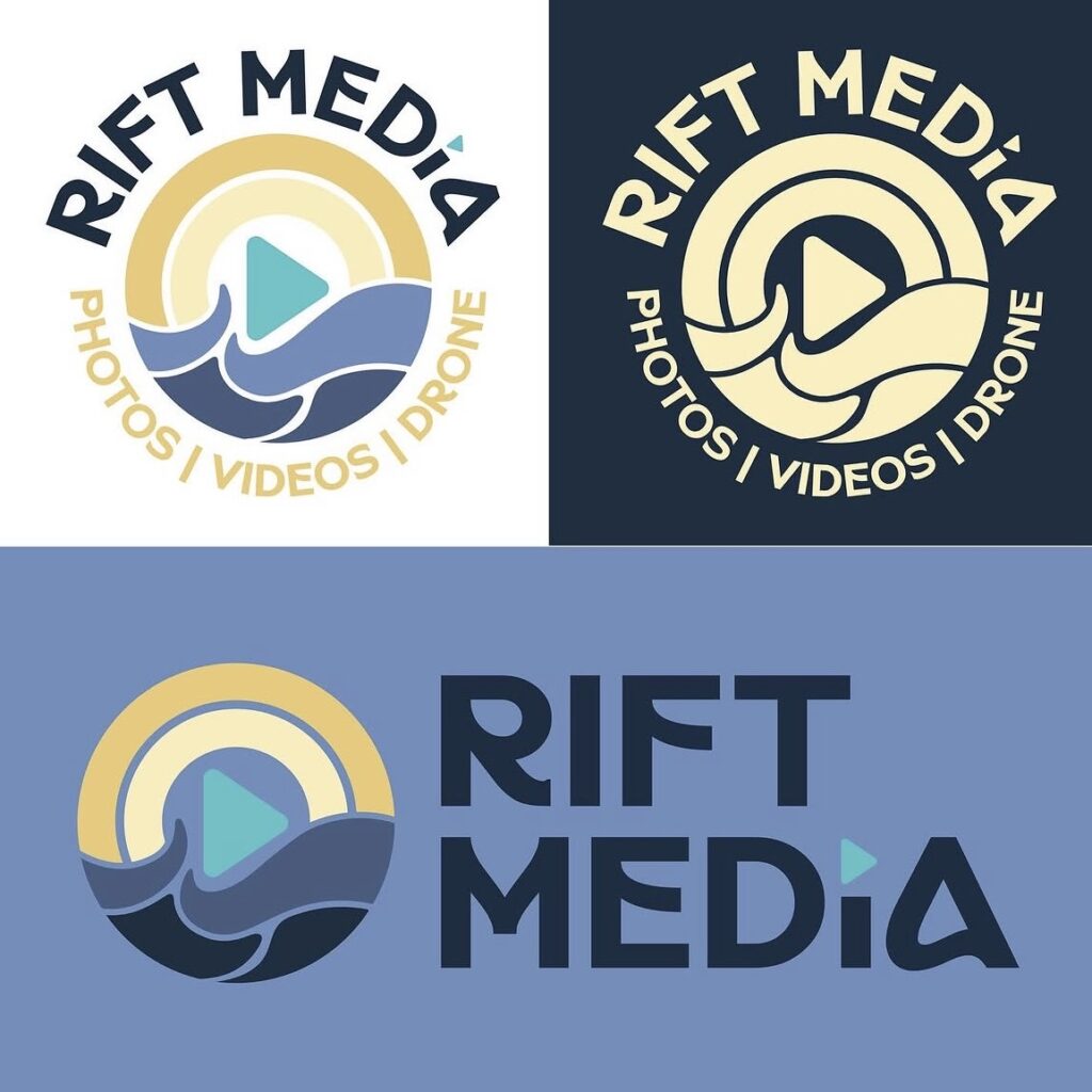
The Meaning Behind The Brand
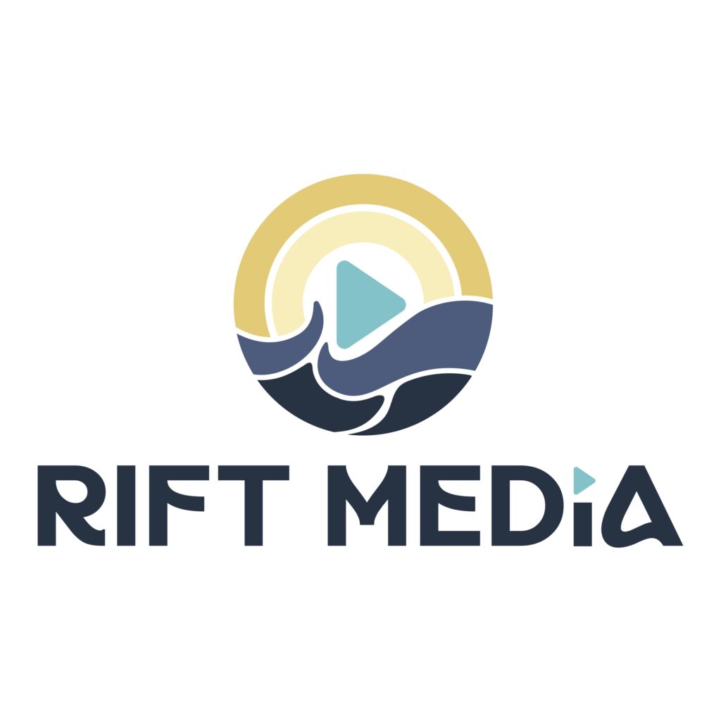
The brand is largely inspired by the sunny California coast and the calming movement of ocean waves. The typography conveys a bold, youthful energy, with curved elements that echo the flow of rolling surf. The imagery reflects not only the sun and ocean, but also a camera lens with a centered play button. This identity blends retro and modern influences, resulting in an overall energetic and refreshing feel.
The Solution
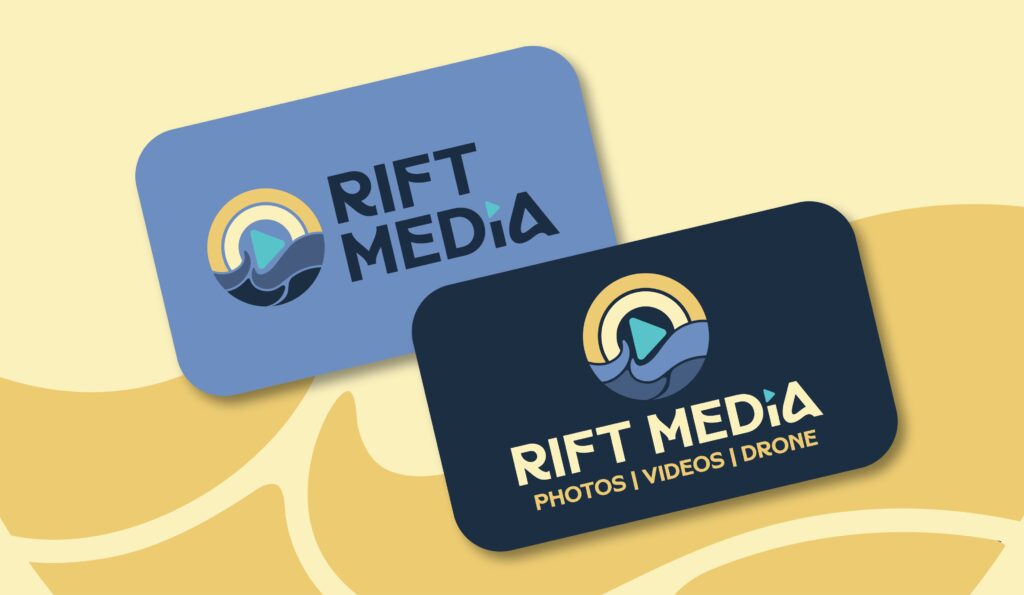
Through thoughtful collaboration, we developed a direction that feels personal and authentic to their vision. The brand now conveys their youthful professionalism, paired with unique imagery that relates back to their hometown. We also designed business cards that bring their new brand identity to life.