Erin came to us looking for branding that would help her stand out from other real estate agents. She was looking for something unique and vintage that tied in her personality and interests outside of realty. Being a previous client, she knew we could execute her vision.
The Process
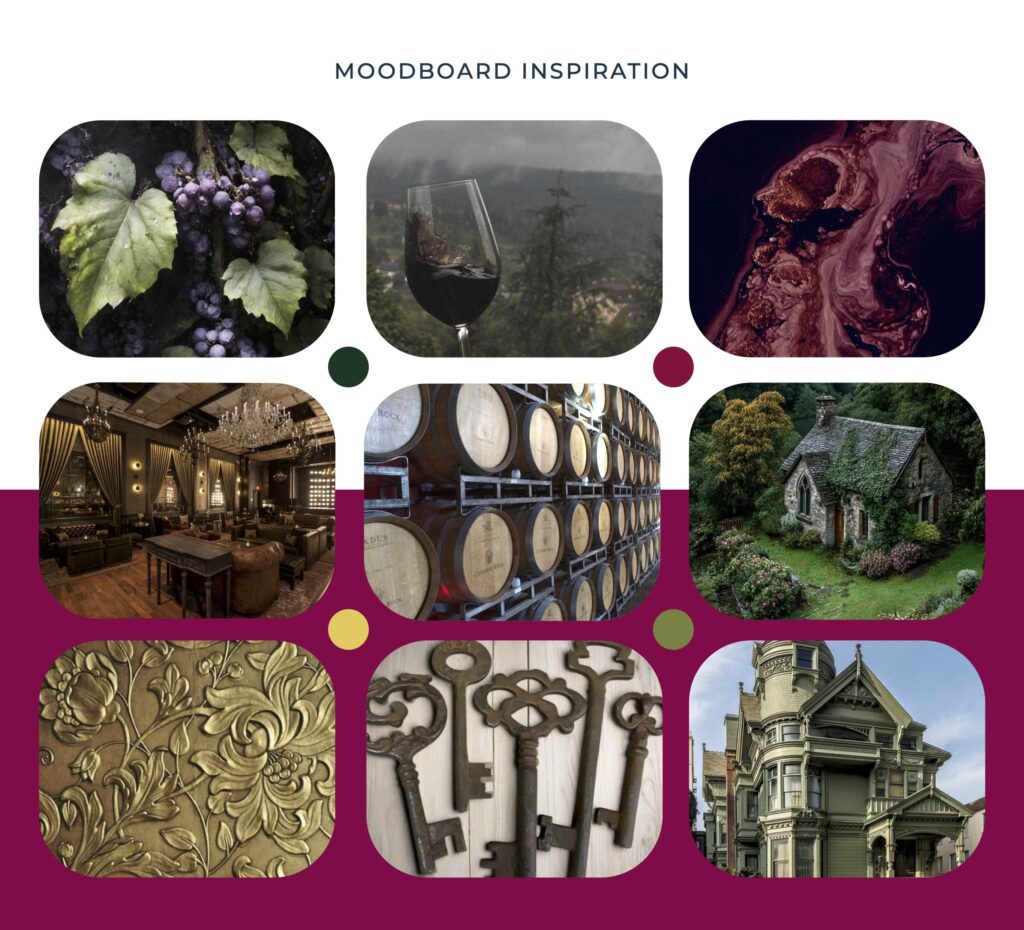
We worked closely with Erin to determine the vintage style she was looking for, how we could pay tribute to her knowledge and interest in wine, and figure out how best we could portray her unique approach while staying professional in the field. We used this information moving forward.
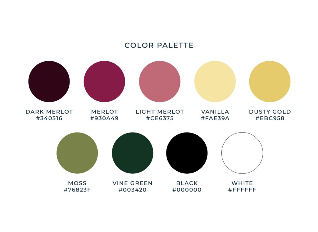
The Color Palette
The color palette was thoughtfully crafted to reflect PNW wine country and the Prohibition style of the 1920s. The deep wine colors and greens are reminiscent of merlot and grape vines, while the warm golds and dusty pink further play into the colors of the roaring 1920s. Together, they create a visual language that feels both fun and sophisticated, mirroring Erin Donahoe’s approach to reality. This palette feels lush, ornate, and timeless, which is perfect for a brand that embodies honesty, patience, and humor.
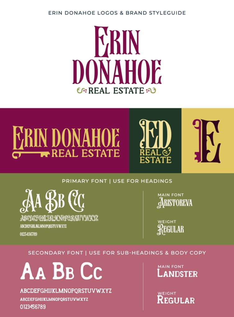
The Meaning Behind the Brand
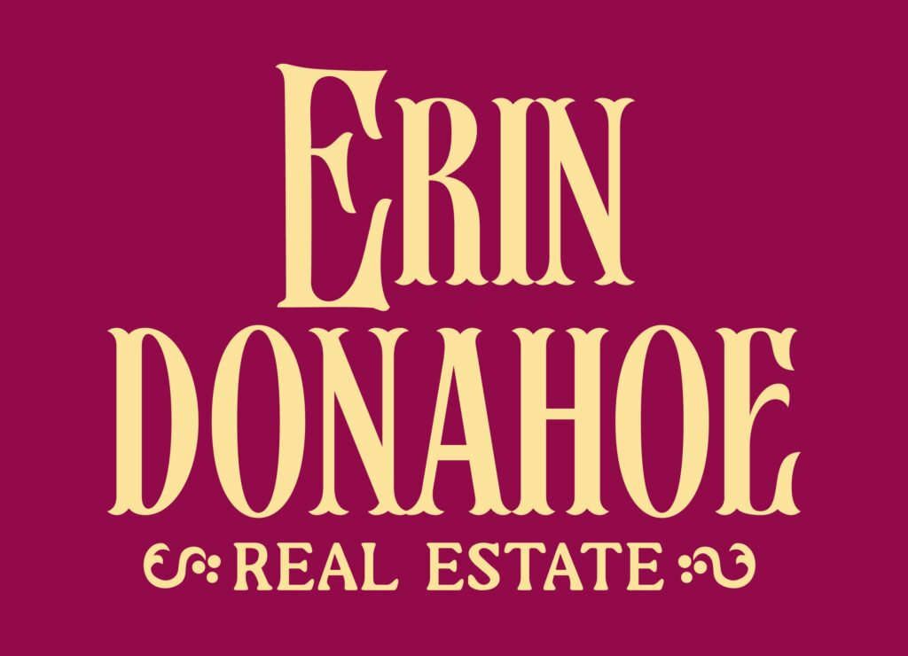
The brand blends a sense of vintage elegance with modern roots in the Pacific Northwest. The key icon offers a subtle nod to the real estate profession without relying on overused industry imagery. The typography draws inspiration from a vintage prohibition era style, balanced with the refined feel of a modern vineyard. Together, these elements create a visual identity that combines distinctive real estate cues, expressive typography, and a warm, inviting tone, reflecting Erin’s personality and her approach to business.
The Solution
Through mindful collaboration, we brought her unique vision to life and helped her stand out. Her branding now reflects her inviting and authentic personality, with thoughtful ties to her work in real estate and her love of wine and vintage motifs.