AiB Landworks came to us seeking a simple visual identity with a touch of vintage ruggedness. They wanted a brand that would resonate with their ideal clients while standing out in a competitive space with a Pacific Northwest feel.
The Process
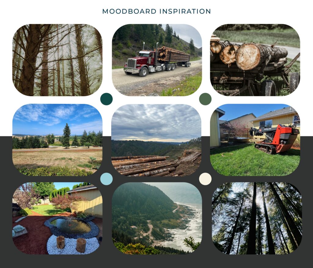
We collaborated closely with the client to understand their audience, brand history, and the feeling they wanted to communicate. This foundation guided a direction rooted in authenticity, emphasizing a strong connection to the local forested landscape and the hardworking nature of their business.
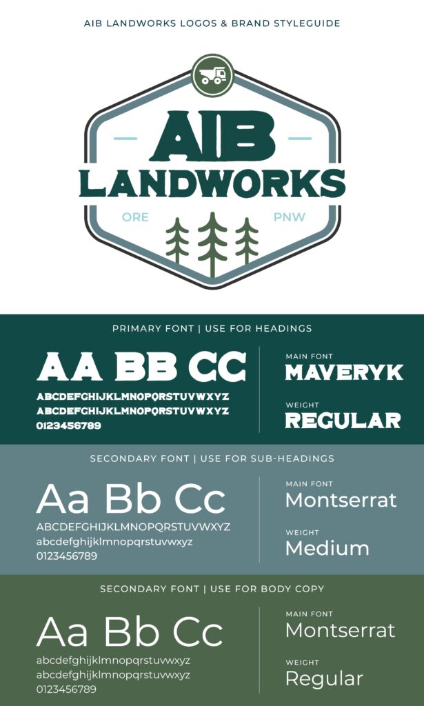
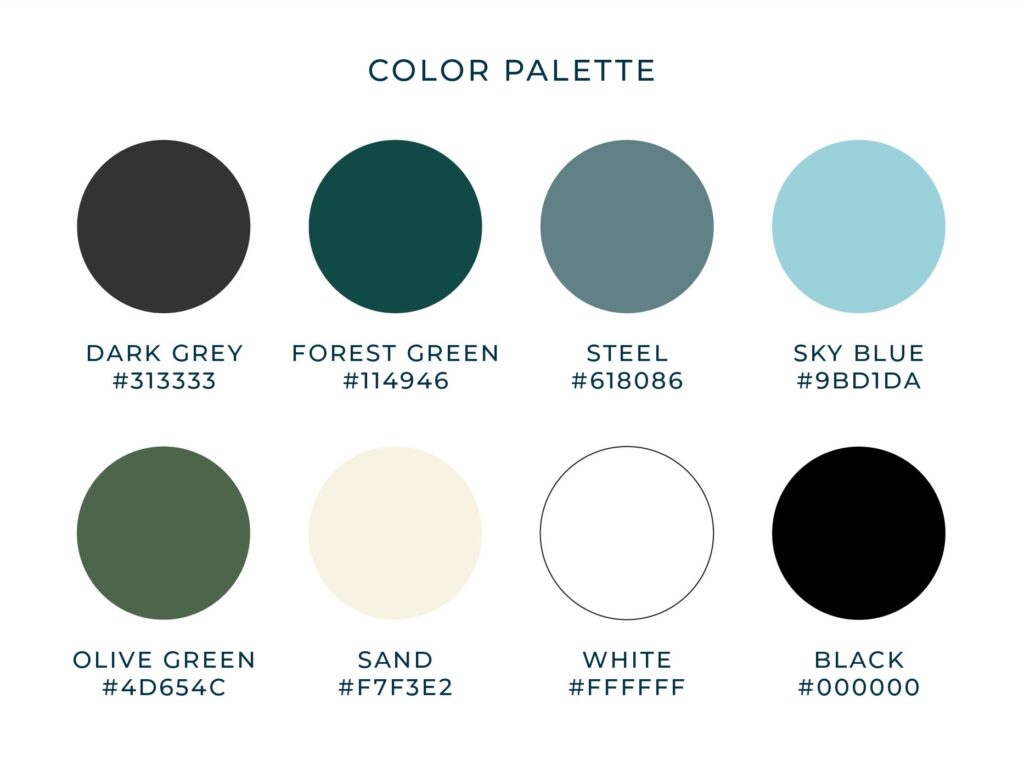
The Color Palette
For the color palette, we chose a combination of dark grey, forest green, steel, sky blue, olive green, and sand to reflect a grounded and dependable brand. The deep greens represent growth, resilience, and a strong connection to the land, while dark grey adds stability and professionalism. Steel and sky blue bring in a sense of clarity and balance, and the olive tones reinforce a natural, hardworking feel. Sand softens the palette with warmth and approachability, creating a look that feels both rugged and refined.
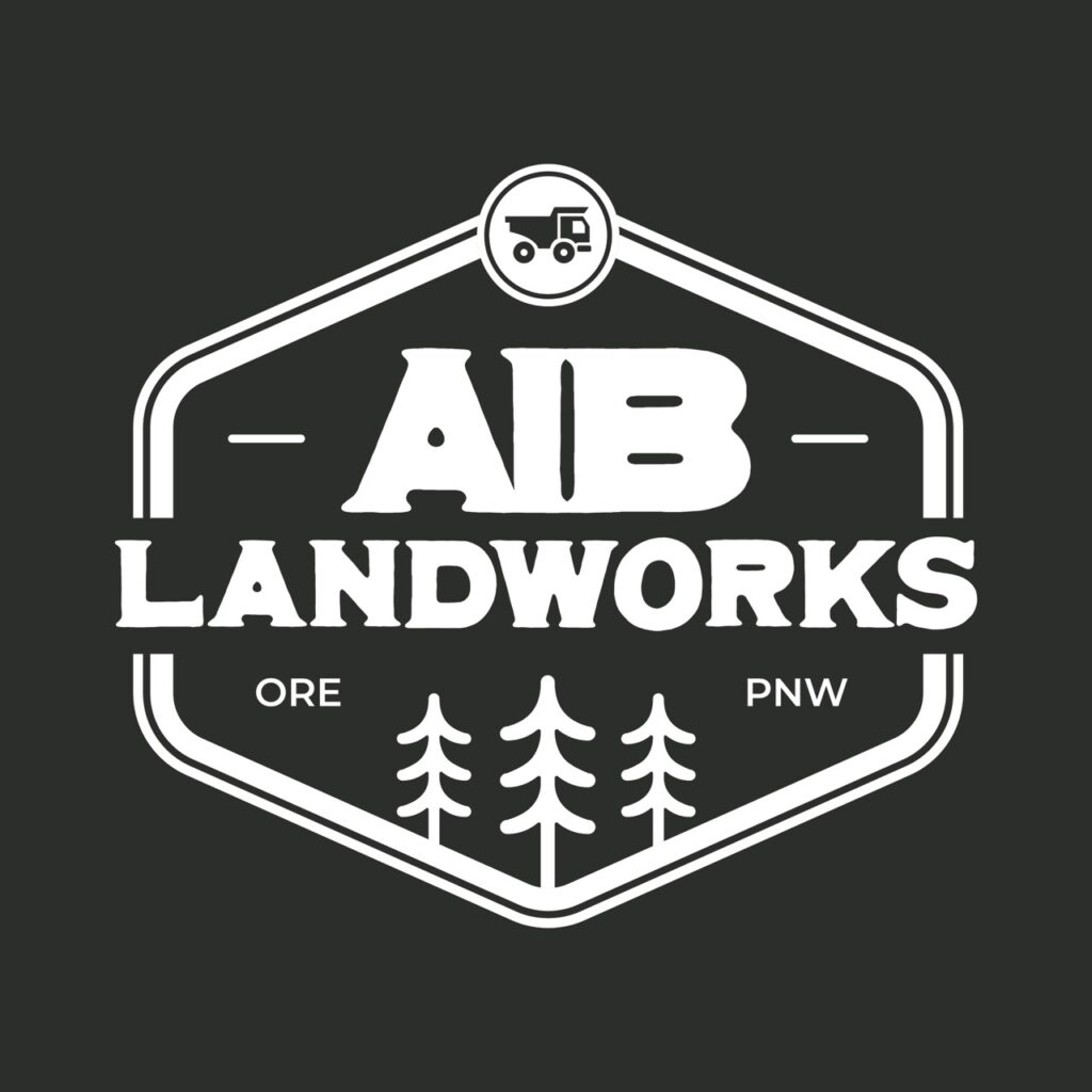
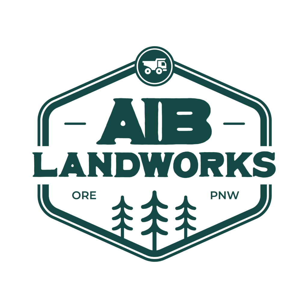
The Meaning Behind The Brand
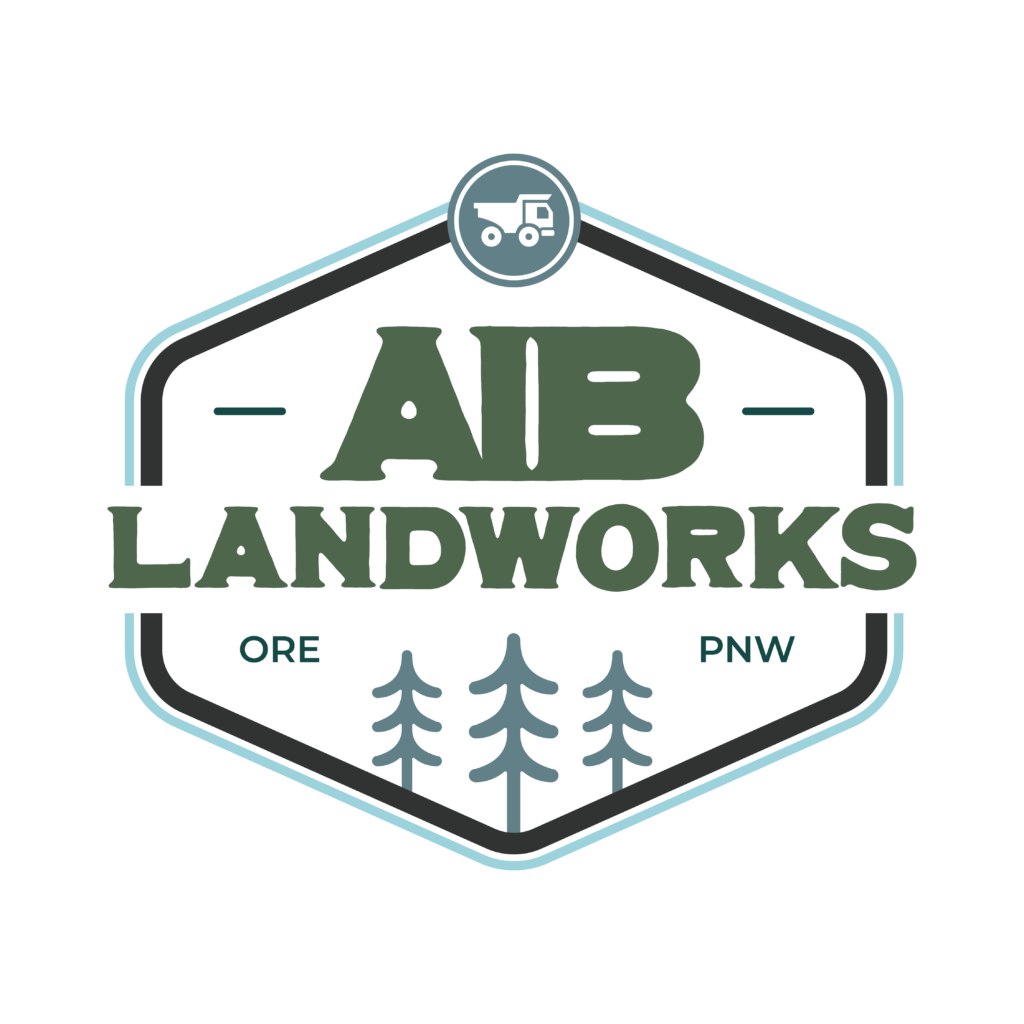
This identity was built to communicate hard work and professionalism, grounded in Oregon’s natural landscape. The primary typeface introduces a rugged, outdoor character, supported by colors and imagery that reinforce the same earthy narrative.
The Solution
Through close collaboration, we developed a clean and simple brand with a rustic outdoor edge. The AiB Landworks identity reflects their craftsmanship and professionalism, while staying deeply rooted in their Pacific Northwest community.