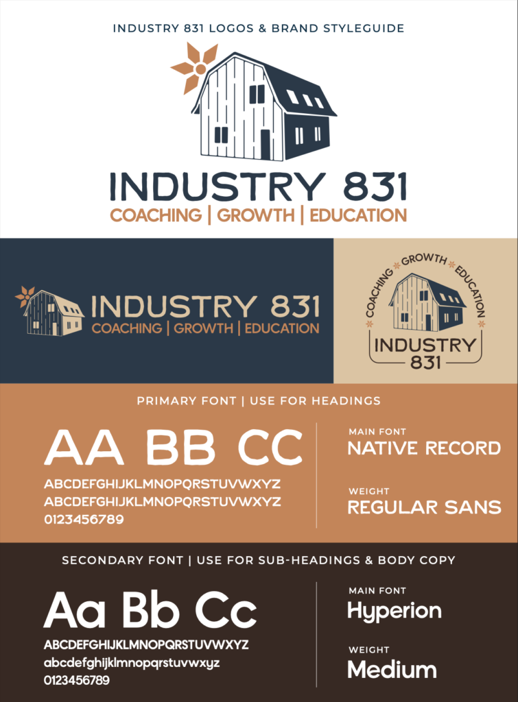
Summer came to us as a wellness coach looking for a brand that felt personal to her background and story. Industry 831 pays homage to her family barn address, which has been in the family for over a century. Our goal was to create a vintage, classic identity that captured the character and history of the barn.
The Process
We worked closely with Summer to understand her specialties as a wellness coach, her ideal audience, and the feelings she wanted her brand to evoke. From there, we built an identity rooted in her story, with industrial influences and a strong sense of family history.
The Color Palette
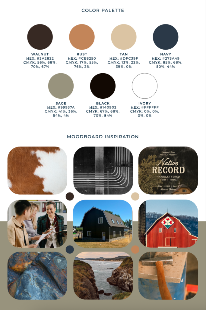
This color palette reflects stability, trust, and growth. Deep walnut, black, and navy create a strong, dependable foundation, while sage and tan bring balance and calm. Earthy rust adds warmth and vitality, with white providing softness and clarity. Together, these colors create a natural, welcoming identity that reflects connection, resilience, and support.
The Meaning Behind the Brand
The icon is a hand-traced interpretation of Summer’s family barn, created from a photograph of the original building. Wooden elements and an intentionally imperfect finish add texture and a rustic, handcrafted feel. The flower draws inspiration from vintage barn quilts while doubling as a subtle sun element. Bold, unique typography adds strength and individuality, reflecting the personality behind Industry 831. Paired with the color palette, the result feels warm, inviting, and deeply connected to its history.
The Solution
Through close collaboration, we created a brand that is deeply personal to Summer while still feeling welcoming to those seeking guidance and support. The final identity balances vintage character with strength and personality, giving Industry 831 a visual story that feels as meaningful as the work behind it.