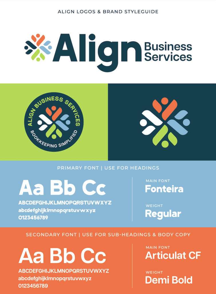
Align came to us looking for branding for their new bookkeeping business. They wanted something simple and professional while still standing out from the competition. The goal was to create a clean, modern identity that subtly reflected the client’s roots and the history of bookkeeping.
The Process
We worked closely with our client to understand her goals as a new business, the story behind her brand name, and her ideal clientele. Our focus was to blend modern simplicity with historical influence, creating a concept that felt both meaningful and distinctive.
The Color Palette
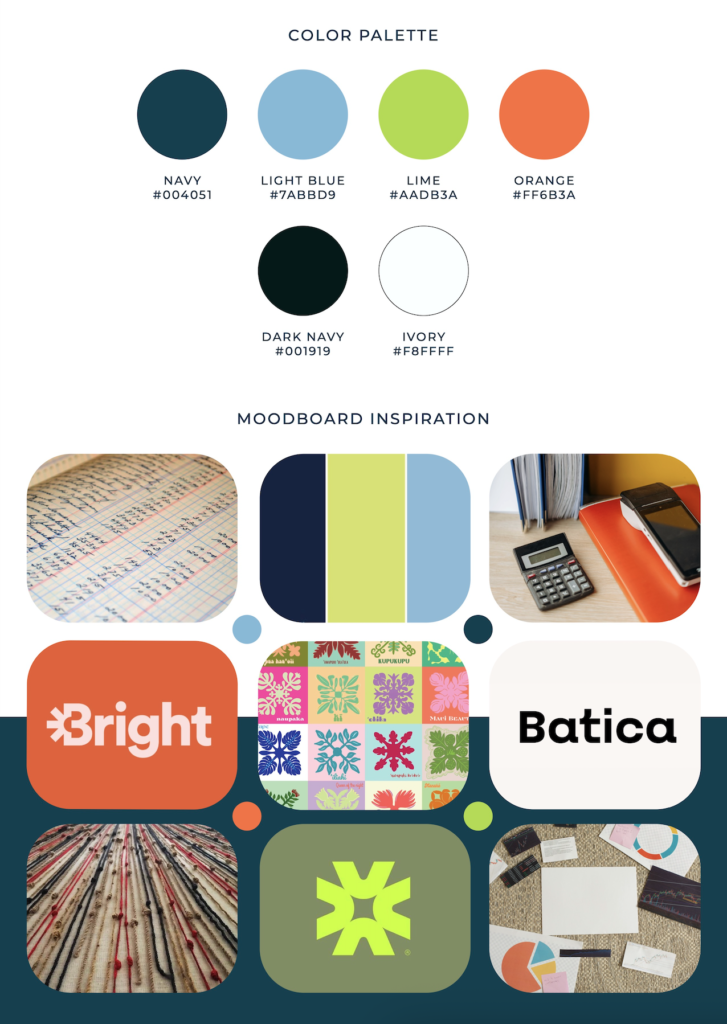
The color palette reflects a modern approach to professional bookkeeping, balancing trust and clarity with warmth and approachability. Deep blue conveys reliability and expertise, while soft sky blue adds openness and ease. Vibrant green and coral bring energy and personality to the brand. Together, these colors create a polished yet welcoming presence that feels bold, approachable, and untraditional.
The Meaning Behind the Brand
The icon draws from both the history of bookkeeping and the client’s Chinese and Hawaiian heritage. We took inspiration from ancient Chinese patterns and the bold, symmetrical designs of Hawaiian quilts, as well as the historical Hawaiian practice of recording information with knotted cord. The mark symbolizes a twisted knot, subtle asymmetrical alignment, and an abstract letter “A,” while also representing people coming together. The bright, contrasting colors echo traditional Hawaiian quilts, and when paired with bold modern typography, the identity feels professional, vibrant, and rich with subtle historical meaning.
The Solution
Through close collaboration, we created a brand that feels simple at first glance while carrying deeper meaning. The final identity balances professionalism with warmth and personality, giving Align a distinctive presence that stands apart from the competition.