WellMama came to us looking to completely refresh their website and update their existing branding. They found that their current logo did not reflect their brand, and their site was hard to navigate and not cohesive with their branding. They needed a full visual identity that was personal and authentic to them.
The Process
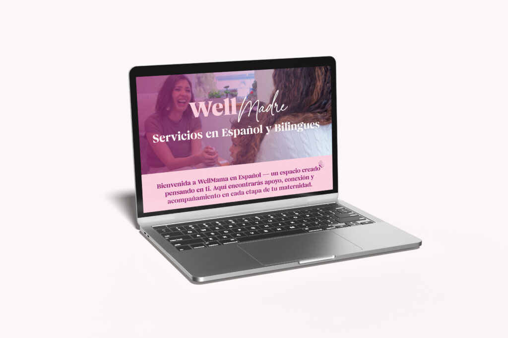
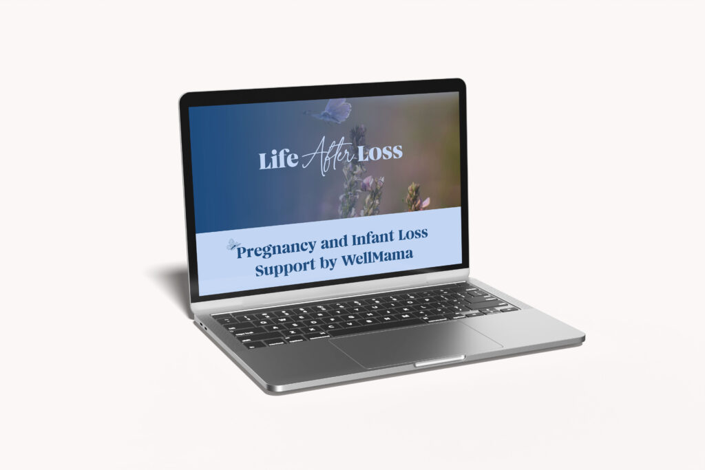
After meeting the WellMama team when Ellyn became a mother, we knew this project would be especially meaningful. We worked closely with their team to understand their story, clarify their goals, and build a cohesive brand identity that reflected WellMama as a whole, along with their two sub-brands, “WellMama en Español” and “Life After Loss.”
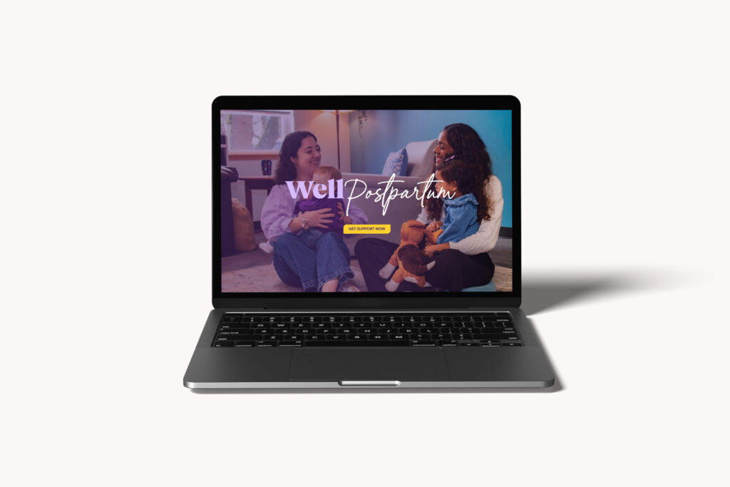
From there, we developed a thoughtful brand system with updated typography, color palette, graphics that reflected their soft, supportive care while connecting with families seeking their guidance. We also project managed a full photo and video shoot, including office photography, team headshots, a group team portrait, family session images, and two brand videos. Once the branding and photography / videography stages were complete, we moved on to design and develop a fully refreshed website.
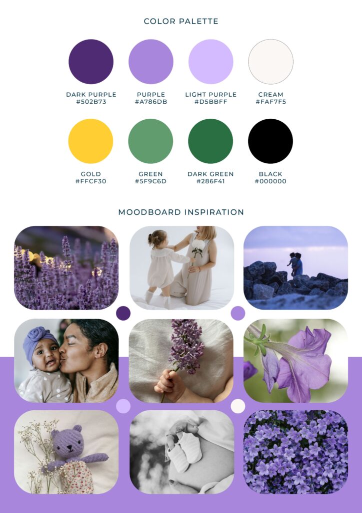
WellMama Mood Board & Color Palette
The Color Palette
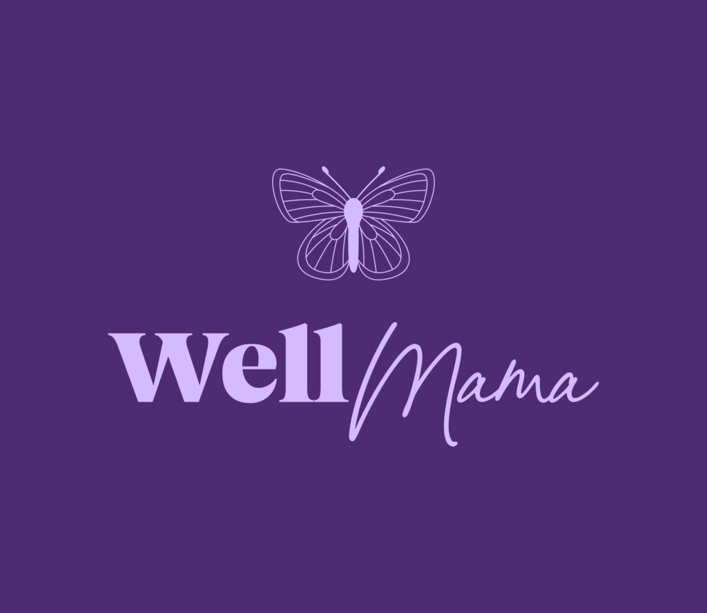
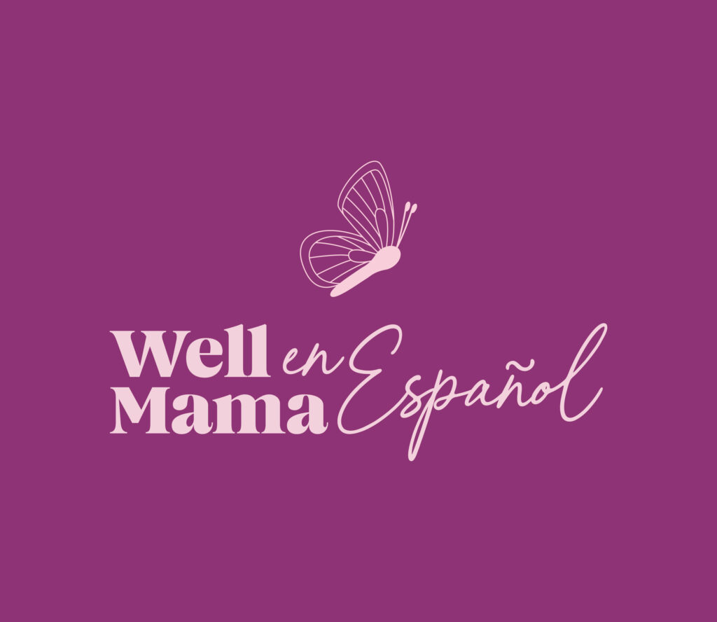
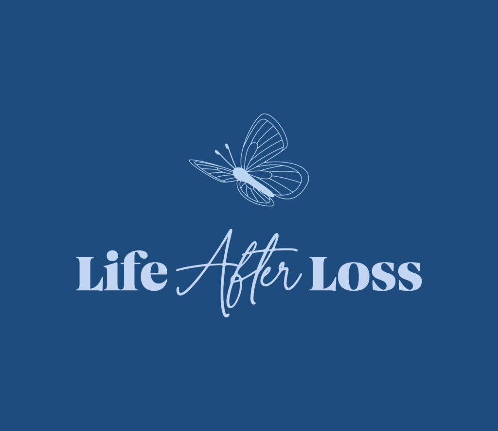
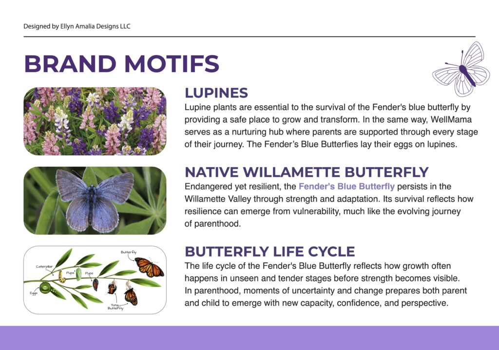
The color palette was inspired by the Fender’s blue butterfly, a rare species found in the Willamette Valley, along with the lupine flowers where they lay their eggs. Rooted in the idea of metamorphosis, the palette reflects transformation, nurture, and interconnected growth.
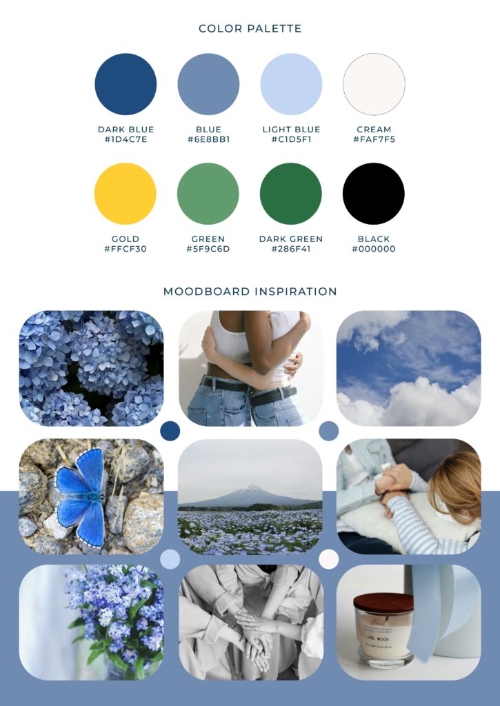
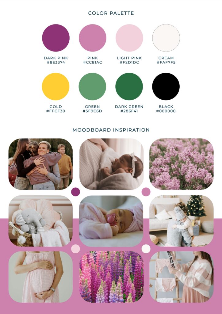
The rich violets used for WellMama’s main brand identity symbolize depth and resilience, while softer lavenders and muted neutrals evoke safety and emotional grounding. For WellMama en Español, warmer rose tones introduce cultural warmth, familiarity, and relational connection. Life After Loss incorporates deep blues to convey compassion, reflection, and quiet strength.
Together, the palette creates a visual ecosystem that feels supportive and welcoming, mirroring WellMama’s role as a nurturing hub where parents are held, transformed, and strengthened through every stage of their journey.
Life After Loss Mood Board & Color Palette
WellMama Español Mood Board & Color Palette
The Meaning Behind The Brand
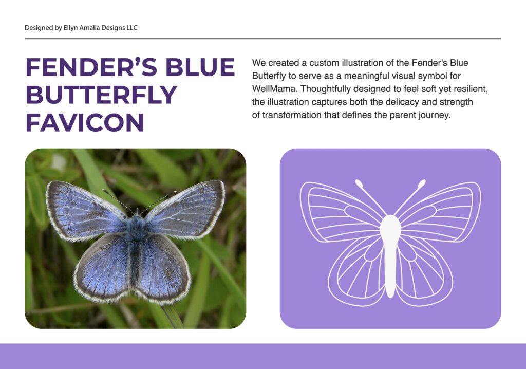
This project is our largest project to date and has been incredibly meaningful to us. WellMama is a nonprofit that supports new, expectant, and grieving parents through pregnancy and postpartum with mental health resources, education, wellness services, peer support, and advocacy. Through WellMama en Español and Life After Loss, they also provide Spanish-language support and specialized care for grieving families, all connected through one compassionate team. The branding was designed to reflect WellMama’s gentle, authentic support and sense of connection. Butterfly motifs inspired by the native Fender’s blue butterfly were paired with lupine illustrations to symbolize support, growth, and interdependence. Each sub-brand has its own butterfly, while the shared lupines visually unite them under one connected circle of care. The color palette was refreshed with brighter yet soft tones to evoke hope and approachability, while the typography balances warmth and professionalism through a gentle script paired with a bold primary font.
The Website
Our in-house design team worked closely with our back-end website developers, photographer and videographer to create a comprehensive and visually appealing website. The previous website was difficult to navigate and contained an overwhelming amount of text in certain areas. We created an easy-to-navigate layout that still included the important information behind their meaningful work while making it easier for users to digest.
The site features a calendar showcasing their support groups and events, along with custom code throughout to create smooth interactivity. It also includes dedicated pages for each sub-brand with custom headers and footers that connect back to the overall brand while still highlighting their unique services and information. This was especially important for the Life After Loss page, where the content needed to feel more thoughtful and supportive due to its sensitive nature. Each sub-brand also includes its own separate events page.
Through meaningful collaboration between our team and the WellMama team, we were able to create branding and a website that truly reflected their story and conveyed their deep support for families. The WellMama brand now captures their soft, personal approach to care, paired with a website that feels natural, approachable, and easy to navigate.
This has been our biggest project to date, and we are incredibly grateful that the WellMama team trusted us to help bring something so meaningful to life. We’re excited to see how the new brand system supports their continued growth and transformation.