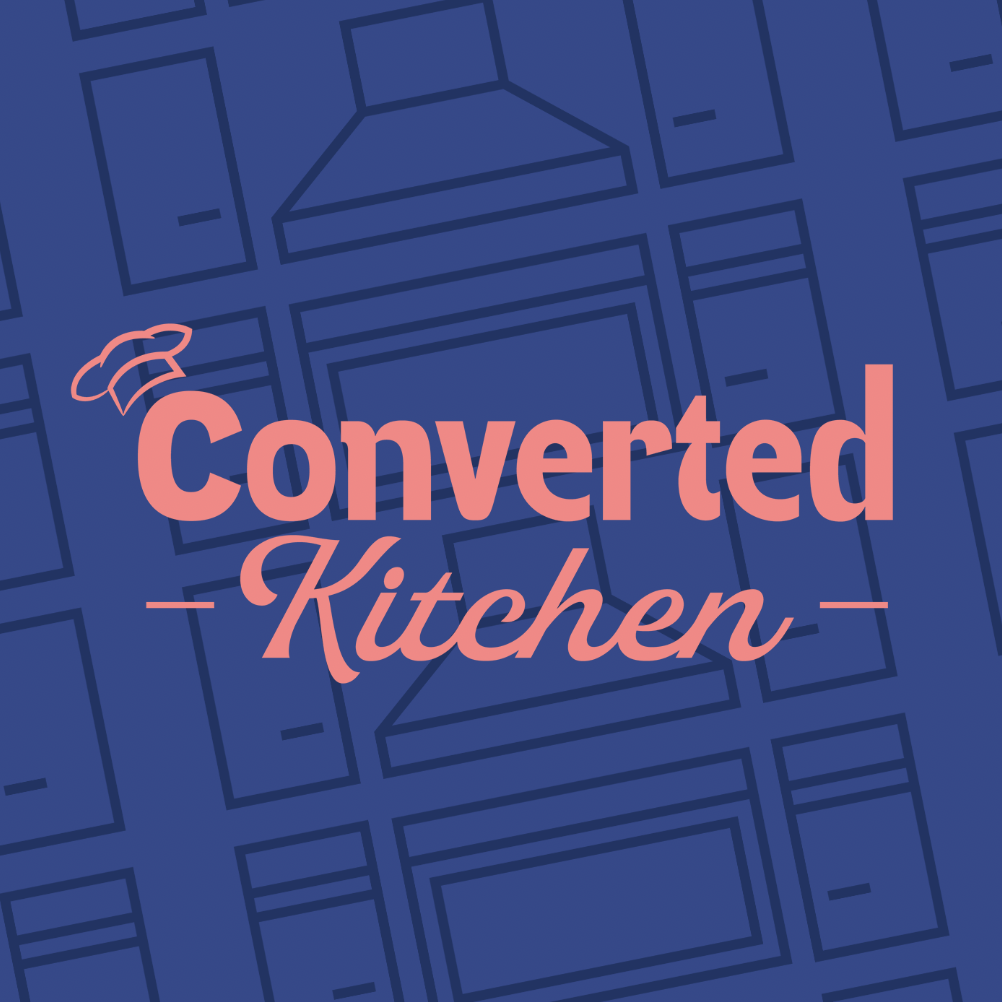
Converted Kitchen came to us seeking a visual identity that reflected their kitchen remodel business. They wanted something clean and modern, while still feeling bold enough to stand out in a competitive market. The goal was a brand that felt fresh, elevated, and distinct from others in the industry.
The Process
We worked closely with the client to understand their story, audience, and the feeling they wanted their brand to convey. Our focus was to create a visual identity that felt simple yet elevated, with a fresh and engaging presence. This insight guided our creative direction.
The Color Palette
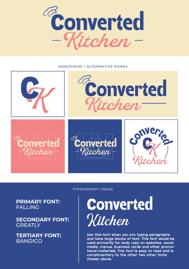
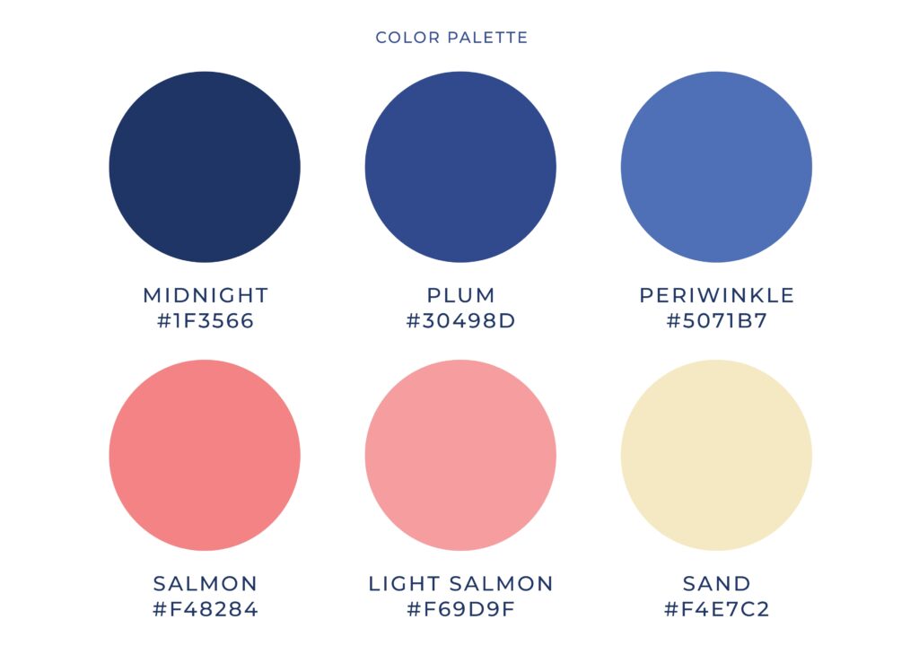
For the color palette, we chose a blend of deep midnight blue, plum, and periwinkle paired with soft salmon tones and warm sand to create a balance of depth and approachability. The blues reflect trust and stability, while plum adds creativity and periwinkle brings a calm, supportive feel. The salmon tones introduce warmth and connection, and sand grounds the palette with a soft, natural touch. Together, these colors feel steady, inviting, and thoughtfully balanced.
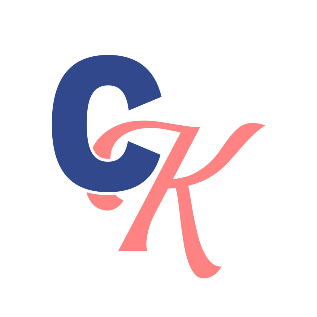
The Meaning Behind the Brand
This brand was designed to balance professionalism with a bold, modern edge. The client also wanted to add a feminine touch to the brand to cater to women and evoke a warm feeling. The primary font brings a clean and subtle personality, while the secondary font adds a touch of warmth and familiarity. Together, they create a look that feels both refined and inviting.
The Solution
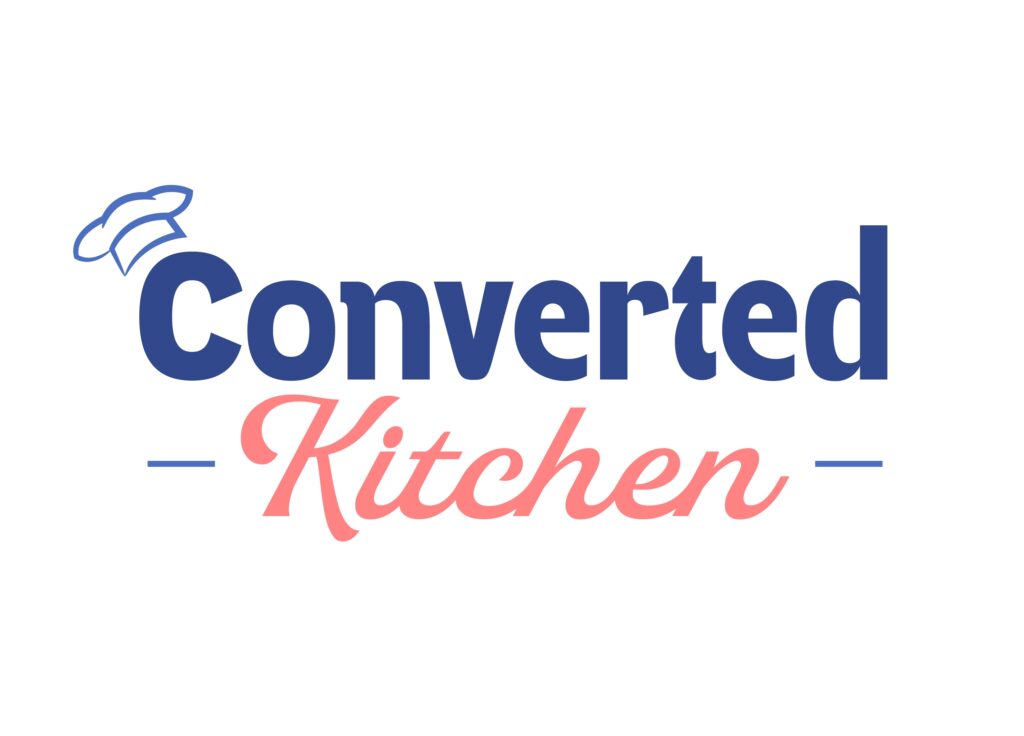
Through close collaboration, we developed a brand that feels bold, inviting, and distinct within the kitchen remodel space. Converted Kitchen now has a visual identity that is clean, modern, and built to stand out.