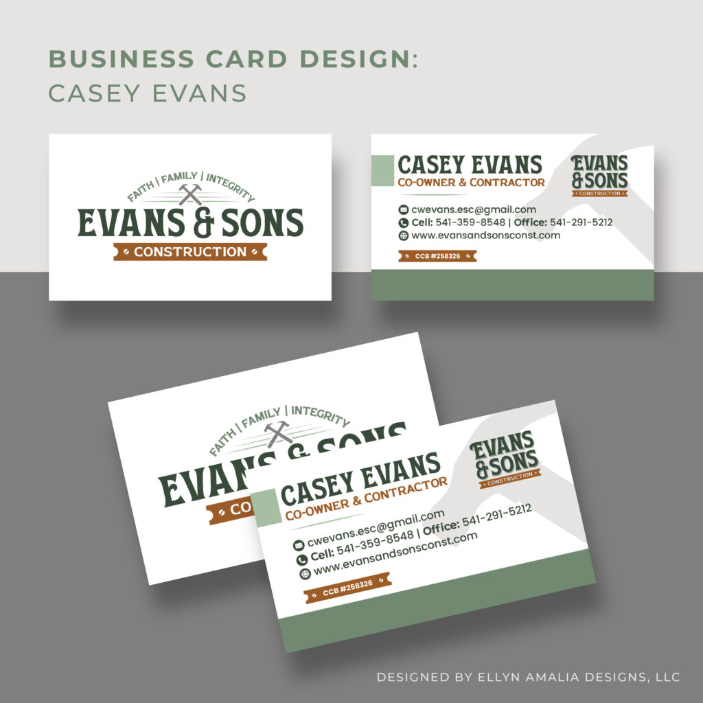
Evans & Sons Construction came to us seeking a visual identity that felt modern while reflecting the legacy of their father-son business. They wanted a brand that carried a retro influence yet remained modern and professional, appealing to their core audience.
The Process
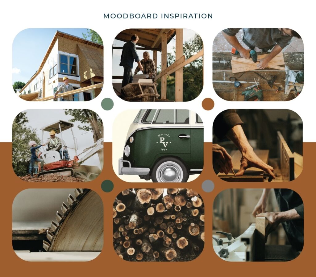
We worked closely with our client to understand their client base, the story behind their family business, and to refine the overall look they wanted to present. Our goal was to deliver a timeless visual identity that stayed true to their background while bringing in a modern, fresh perspective. This information guided our direction.
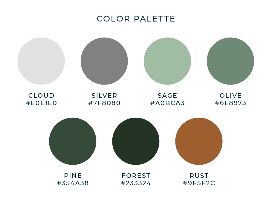
The Color Palette
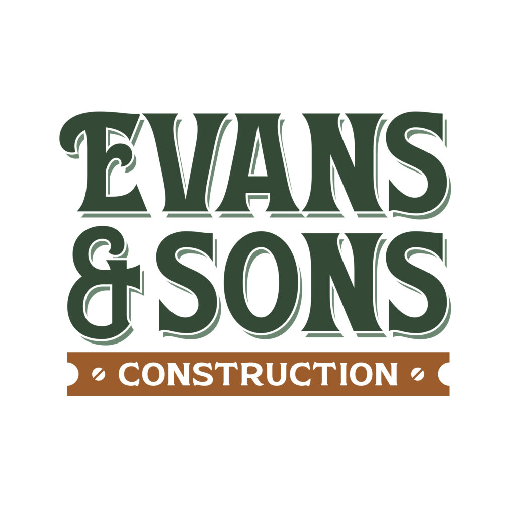
For the color palette, we chose a palette of deep green, rust, and silver to reflect the heart of Evans & Sons Construction, a father-son business rooted in Oregon. Green symbolizes growth and trust, rust represents hard work and heritage, and silver adds a modern touch of precision and quality. Together, these colors reflect craftsmanship, legacy, and integrity.
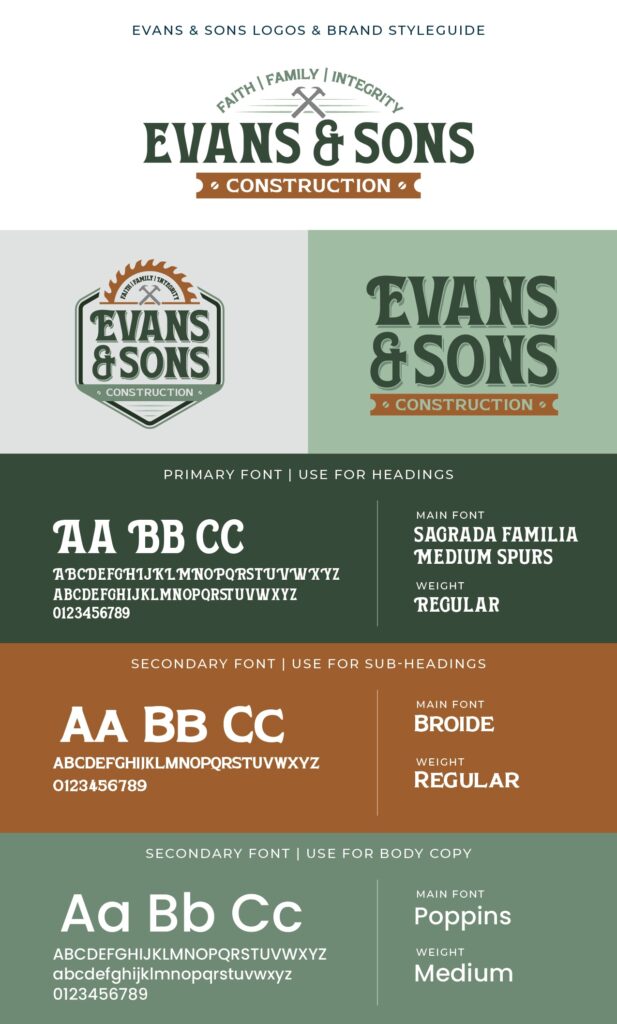
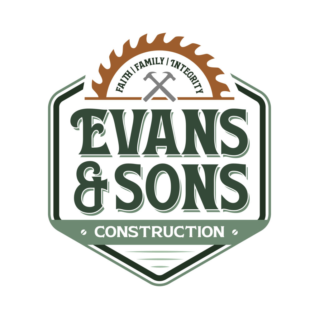
The Meaning Behind The Brand
The purpose behind this branding was to convey the legacy and integrity of the Evans and Sons family background while remaining professional and timeless. The retro-inspired font adds the feeling of heritage and trust, coupled with clean line work and subtle tools to reflect the quality work that they do.
The Solution
Through close collaboration with our client, we developed branding that feels authentic to their story and resonates with the community they serve. The Evans & Sons brand reflects their integrity and family-driven approach, blending a timeless foundation with a modern sensibility.