The Cascades West Innovation Hub is a regional initiative led by the Regional Accelerator & Innovation Network (RAIN) and funded by Business Oregon. The Hub connects entrepreneurs, universities, investors, service providers, and community partners to grow innovation-driven businesses in the four-county Cascades West region. Their goals and mission really aligned with our studio’s mission. Giving them the opportunity to build their brand felt like representation, alignment, and has an impactful impression compared to big-city agencies to create real change.
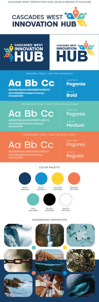
The Color Palette
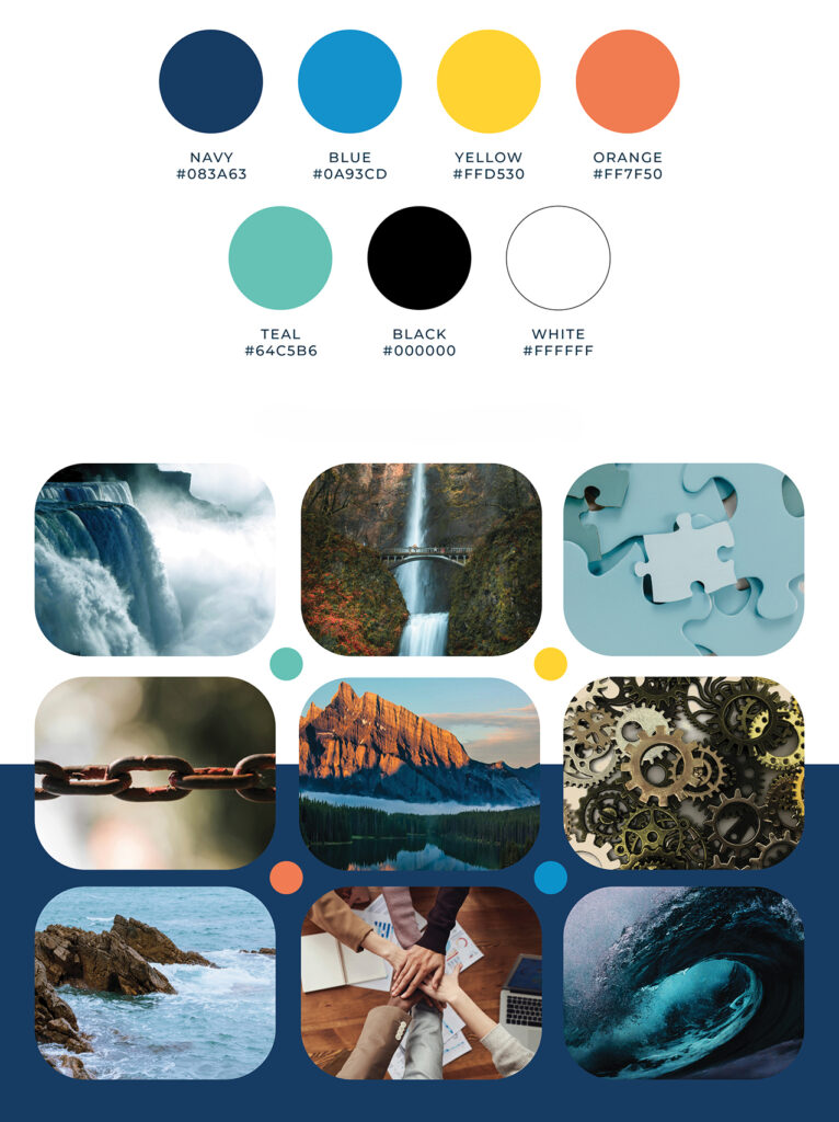
The Cascades West Innovation Hub palette blends familiarity with fresh identity. We started with RAIN Catalysts’ dark blue, blue, and yellow to visually connect the Hub to the larger RAIN ecosystem. These colors bring a sense of trust, clarity, and
optimism-key themes shared across both organizations.
To give the Hub its own unique voice, we added orange and teal as complementary accent colors.
Orange adds warmth, energy, and a feeling of forward momentum.
Teal brings balance, creativity, & a touch of the natural environment of the Cascades
West region.
Together, these colors create a palette that feels unified with RAIN while still giving the Innovation Hub a distinct and memorable identity.
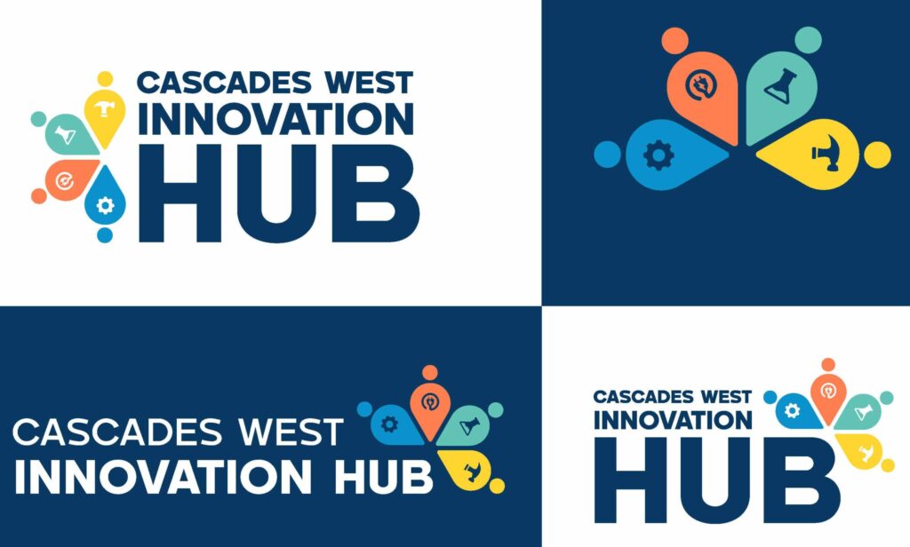
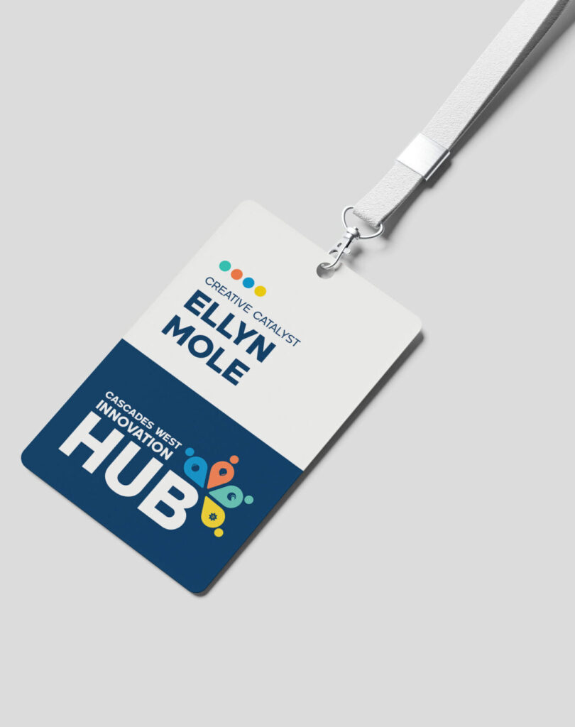
The Meaning Behind The Icon
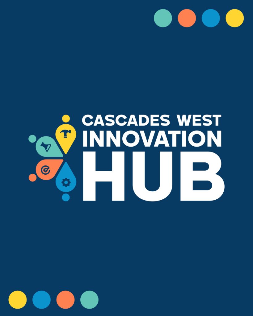
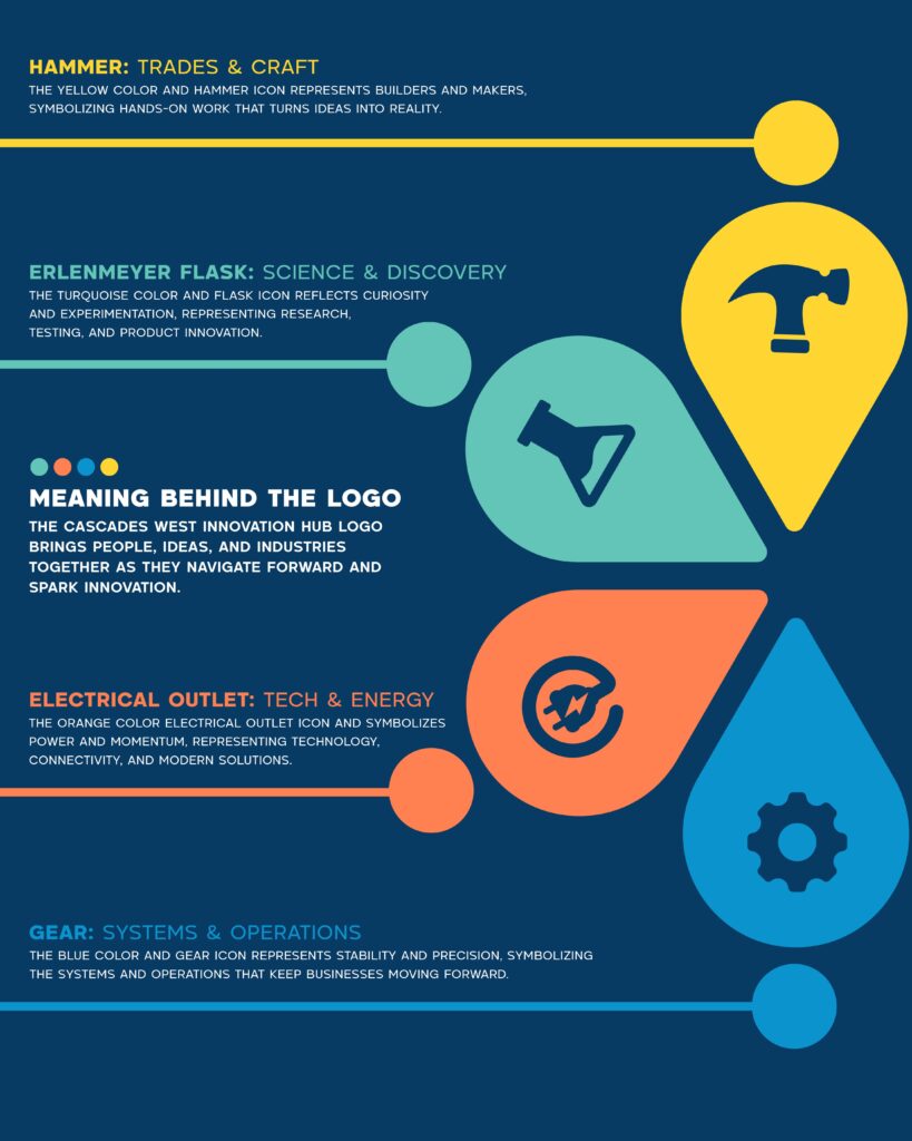
The Iconography of this brand is very important to the brand’s story and mission. The main icon being the “innovation spark”or “creativity spark” represents so much more. Each piece of the colorful spark is also a person and indicative of a navigation symbol. They each symbolize one of the four counties the Innovation Hub serves, coming together in a unified, collaborative form. Within each of those is an inner icon that represents each trade’s sector of innovation at the hub. These are the ideas behind each, with more detail:
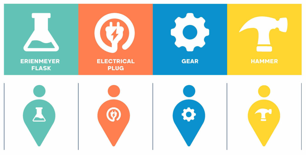
HAMMER: Trades & Craft
The yellow color and hammer icon represents builders and makers. Symbolizing hands-on work that turns ideas into reality.
ERLENMEYER FLASK: Science & Discover
The turquoise color and flask icon reflects curiosity and experimentation, representing research, testing, and product innovation.
ELECTRICAL PLUG: Tech & Energy
The orange color and electrical plug icon symbolizes power and momentum, representing technology, connectivity, and modern solutions.
GEAR: Systems & Operations
The blue color and gear icon symbolizes stability and precision. Representing the systems and operations that keep businesses moving forward.
The Mission of This Brand
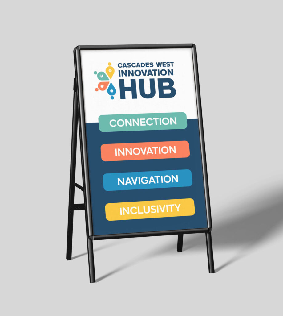
CWIH’s mission is to strengthen the innovation ecosystem, expand access to resources, and foster inclusive economic opportunity across the region. Their branding had to reflect that in order to be most effective for the community. This identity tells a story of people, ideas, and industries moving forward together. Of rural innovation being seen, valued, and invested in. Of small towns building big futures.
The Solution
Every detail in this brand kit was built with intention and care because this work reflects the same values we carry into Ellyn Amalia Designs. Thus, every piece of this brand meets the needs of each piece of CWIH. From the meaningful icon to the friendly professional font it feels like Community, Access, Innovation, Sustainability, and Opportunity.
As a woman-owned small design business in rural Oregon, getting the opportunity to build the brand for Cascades West Innovation Hub meant more than just a design project. It felt like a representation. It felt like alignment. It felt like proof that powerful, impactful work doesn’t have to come from big-city agencies to create real change. Throughout this project we have been grateful for the trust, honored to do this work, and proud to build brands that matter.